So, after documenting how I save a timestamped log of my bash file, I got curious about what kind of analyses I could pull out of it.
(caveat: I only started this logging about a month ago, so there aren’t as many data points as I’d like. However, there is enough to see some interesting trends emerging).
Day of Week
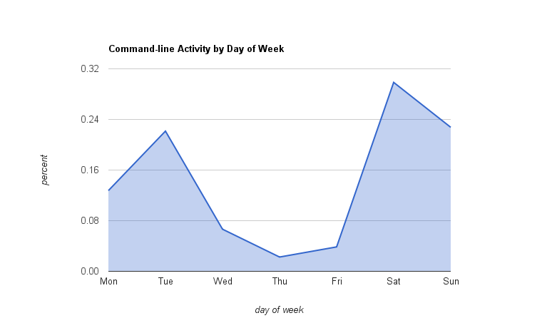
First, here is the spread of activity over day-of-week for my machine at home. I found this surprising! I’d expected my weekend hacking projects to show a significant weekend effect, but I did not notice the Thursday slump. It’s interesting when data shows us stuff about ourselves that we didn’t realize. I have no idea what causes the Tuesday mini-spike.

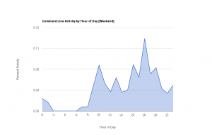
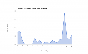
Next, I have activity per hour-of-day, broken up by weekends-only and weekdays-only (because my behavior differs significantly between these two sets).
Weekends
Both charts clearly show my average sleeping times. Weekends show a bump of morning hacking and evening hacking, with less computer time than I’d have expected in the middle of the day.
Weekdays
I love the evening just-got-home-from-work-and-finished-with-dinner spike for the weekdays, followed by evidence of late-night hacking (probably too late for my own good).
Where to go from here
I wonder if the unexpected Tuesday spike and 6pm-weekday spikes are legitimate phenomena or artifacts due to data sparsity. It will be interesting to check back in with this data in a few more months to see how it smooths out. (Ugh, daylight savings time is going to mess with this a bit =/ ).
Also, this only measures one aspect of my activity in a day–stuff typed at the command line, which is mostly programming-related. I would love to plot other information alongside it (emails sent, lines of code written, instant messages sent, songs played, GPS-based movement). I’m tracking much of this already. I’ll need a good way of visualizing all of these signals together, as the graph is going to get a bit crowded. Maybe I’ll pick up that Tufte book
(And, speaking of visualization, I think a heatmap of activity per hour of the week would be interesting as well… Google Spreadsheets doesn’t do those, though, so while I have the data I couldn’t whip one up easily tonight).
Lastly, what’s the purpose of this all? What do I want to accomplish from this analysis? They’re nice-looking graphs, for sure. And honestly there is a bit of narcissistic pleasure in self-discovery. And I suppose it’s good to realize things like the mid-week slump (exhaustion from work? external calendar factors?) are happening.
But I’m eventually hoping for something less passive than just observation. Later I look forward to using this data to change myself. I can imagine later setting goals (in bed by a certain hour, up by a certain hour, no coding on day-x vs more coding on day-y) and letting the statistics show my progress towards those goals.

